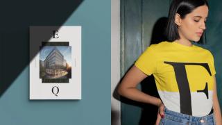
ThreeTenSeven has created a new brand for a flagship development that property company CEG is delivering in the heart of Bristol. The new development, named EQ, has become one of the largest commercial projects currently underway in the south of England.
About EQ and the design solution
COVID has forced property developers and occupiers to re-assess how workspaces will be used in future. However, CEG has already established a reputation for creating developments that balance the needs of employers with the health and wellbeing of their employees. It’s this central idea of ‘balance’ that has defined both the building itself and the brand that supports it.
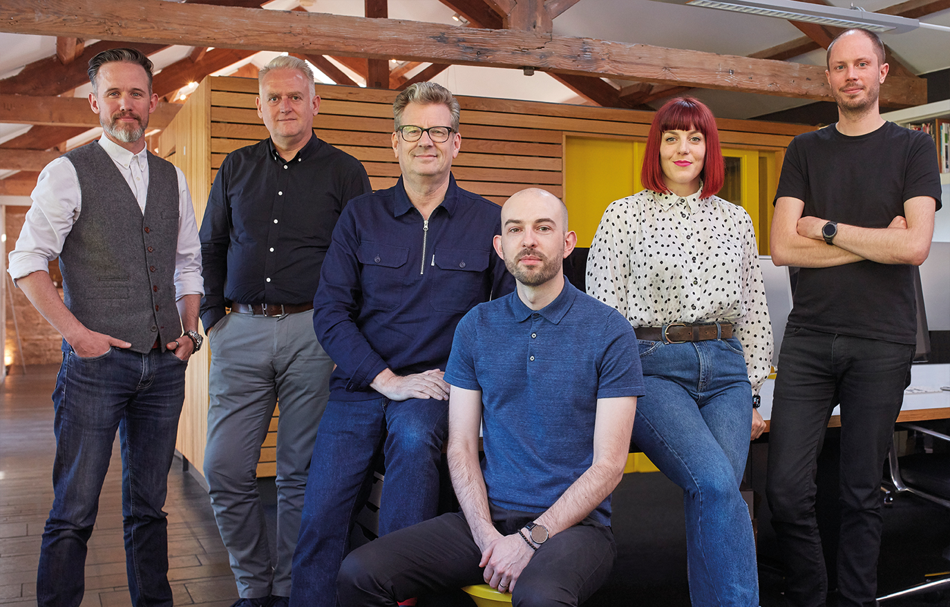
ThreeTenSeven has previously created brands for a number of CEG’s developments including Kirkstall Forge and Temple Leeds. The ThreeTenSeven team has a strong track record in designing for a series of brands with a particular focus on health and wellbeing, among them NHS Digital, NHS England, sexual health charity Brook, and mental health charity Mind.
Located in Bristol city centre, EQ offers 200,000 sq ft of office space over seven floors. However, it has been designed to give occupiers every opportunity to make the most of their time in work and out of hours, with nearly 20,000 sq ft of dedicated amenity space. It features a 20-person fitness studio intended for yoga, meditation and wellbeing talks, hosted by CEG’s on-site team. Employees who cycle to work can take advantage of 263 cycle parking places, along with dedicated shower facilities and maintenance stations.
Throughout, sustainable design and operation have been the highest priorities as the building has taken shape.
What’s in a name?
The name EQ, developed by ThreeTenSeven, is derived from ‘equilibrium’ and highlights the central concept of balance. Visually, the brand plays to this idea, offsetting apparently opposing images of work and life to suggest how these might be brought together in one place. Graphically, the identity runs against ‘corporate’ norms often seen across the sector to create cool, open spaces. At the centre of the scheme is the EQ logo, with lettering spaced to create an opposing tension, while the colour palette is deliberately limited – yellow highlights against a subtle grey background to convey optimism and teal green to communicate sustainability.
ThreeTenSeven has applied the EQ brand across website, online brochure, promotional movie and on-site signage.
From our creative team:
‘Ultimately, we designed the brand identity not for estate managers or CEOs, but for those who will actually work in the EQ building – young Bristolians who are plugged in to the rich culture of the city, people with an appetite for a fresh new approach to work and life.’
Chris Skelton, Creative Director, ThreeTenSeven
“Bristolians have always had a clear sense of what matters most to them, and how they choose to live and work. Early conversations revealed that they don’t necessarily see a divide between their priorities at work and those that inform their personal lives – in particular when it comes to wellbeing and sustainability.”
Nick Hynes, Head of Brand Voice, ThreeTenSeven


