


Our latest intern Aashini highlights some of the brilliant work coming out of design studios in her home country of India.
Wari Watai
Wari Watai is a studio based in Bangalore, primarily working to create narrative based tangible designs that provide culturally driven experiences. I love the work they do because their designs are mindful, culturally driven and rooted in insights driven from in depth research.
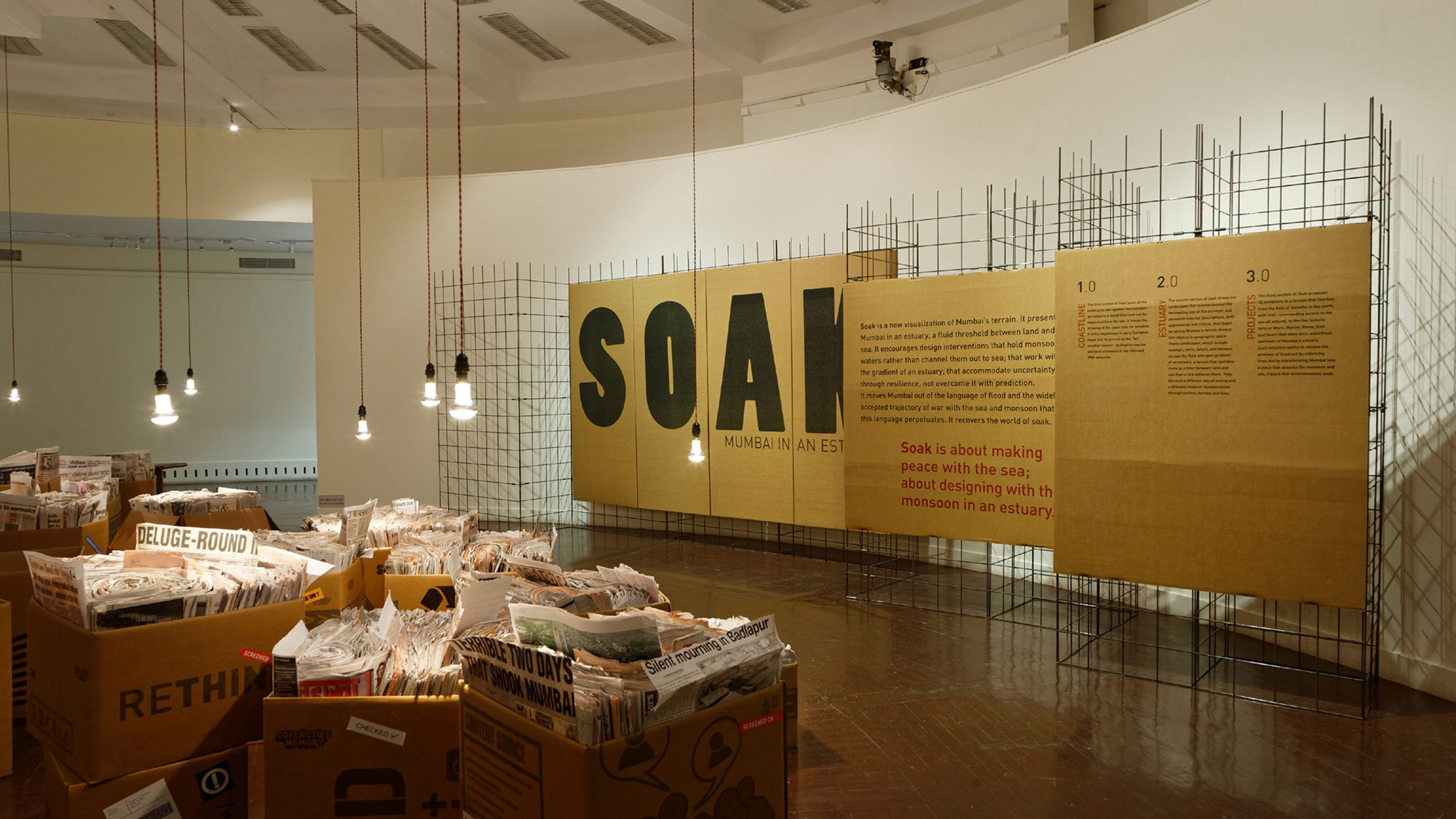
‘SOAK’
The 2005 floods were devastating for Bombay, this exhibition takes a study done by Anuradha Mathur and Dilip Da Cunha to understand their findings in order to devise a communication strategy and a design language for their exhibition ‘SOAK’ at the National Gallery of Modern Art (NGMA) in the city. I like how they have used form and materials to embed contextual meaning to the exhibition. It also provides the locals of the city an experiential insight into Bombay’s terrain and its uneasy relationship with water.
More about the project: https://wariwatai.in/SOAK-Mumbai-in-an-Estuary
Thought Over Design
Thought Over Design (TOD) is a design studio based in Bombay & Goa, it champions in branding and creating brilliant identities for newer/ established consumer facing brands in India with an ethical purpose. I love how the team at TOD creates brands that are changing the face of design and consumer products in India. It is filling the business landscape with memorable and ethical products that are also great to look at!
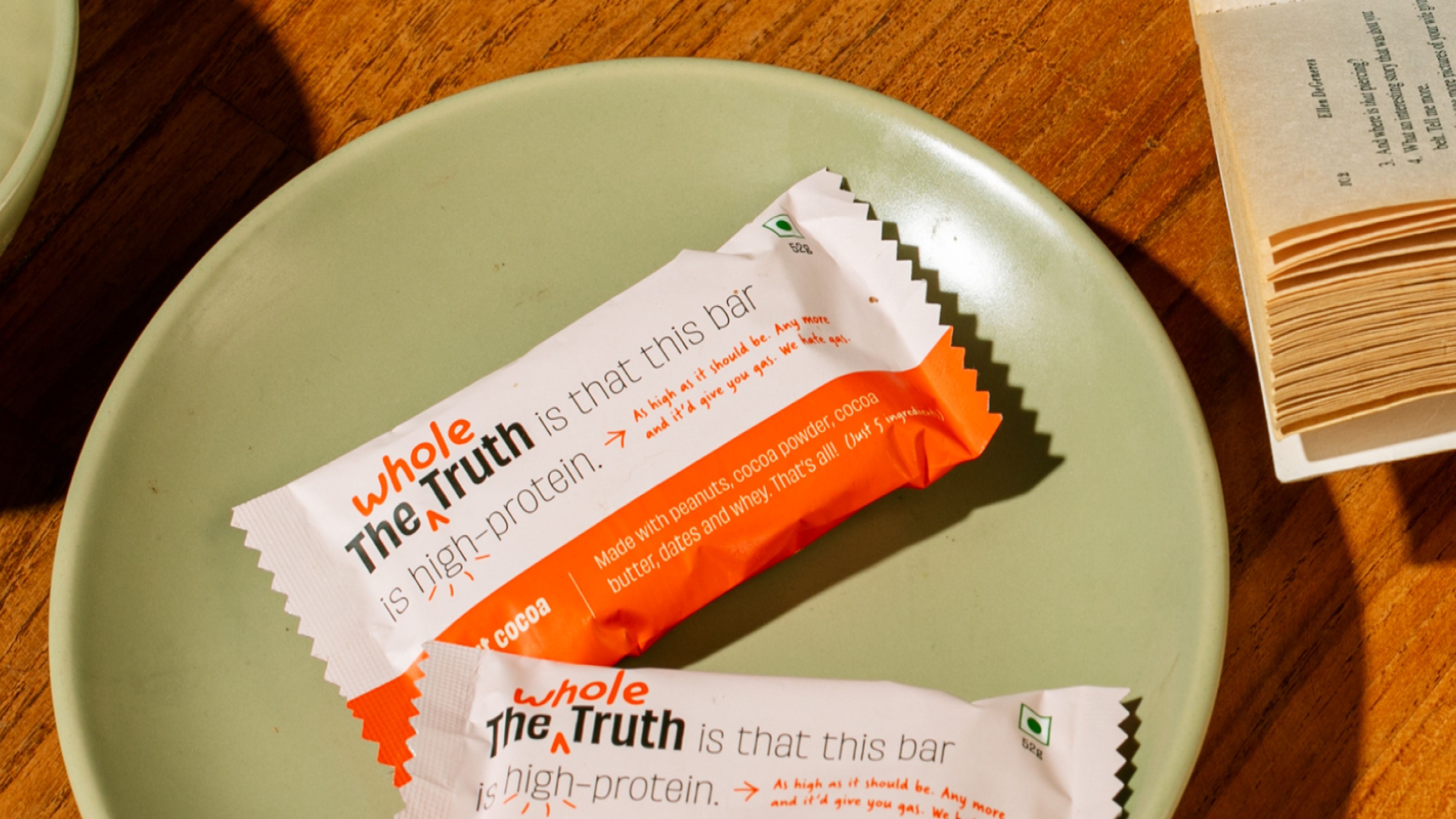
‘The Whole Truth’
The Whole Truth is all about rebuilding trust with 100% clean, transparent products. The name says it all—"The Whole Truth" promises honesty in an industry full of misleading claims. I love the name and branding because it instantly tells you this brand is all about being real. The logo nails it with a modern sans serif font paired with a handwritten script. It’s stylish and personal, perfectly capturing the brand’s commitment to truth and authenticity.
More about the (whole) truth
The Pigeon&Co
Based in Bangalore, Pigeon & Co is a brand that stands out to me for their playful and humorous approach to design. Their work is characterised by a light-hearted, whimsical quality that is consistently entertaining. They infuse their projects with a sense of playfulness and a touch of the absurd, ensuring that the brands they partner with share a desire to create something delightfully unconventional. Pigeon & Co’s distinctive style embraces the quirky and the offbeat, making every project a testament to their commitment to imaginative and engaging design.
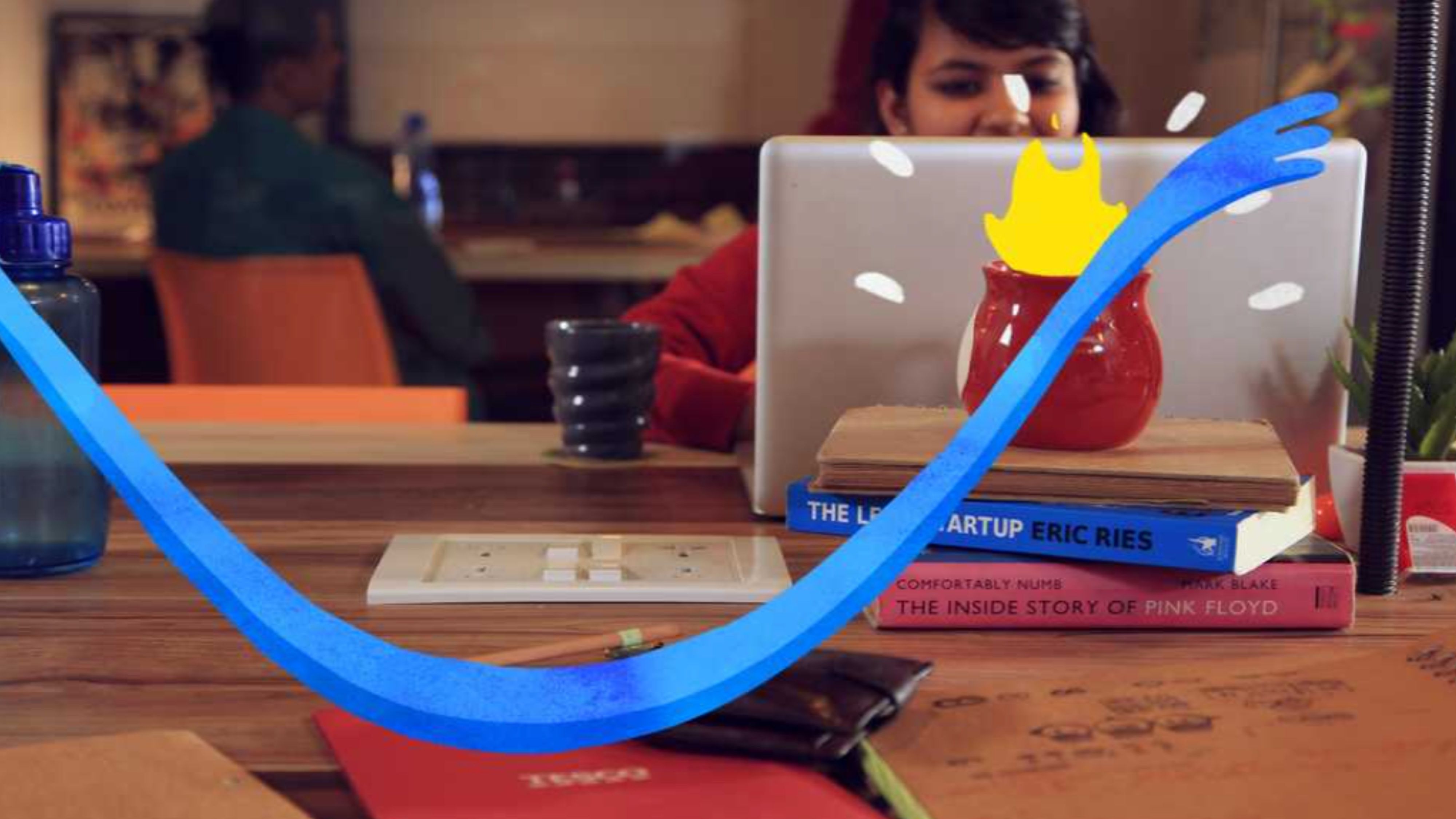
‘Glitch’
The Pigeon&Co did a website for Glitch, which is a design agency based in Mumbai and Delhi. The website that was created is an interactive, immersive experience into Glitch’s office and it reflects on the creative energy of the studio. The visual animation is fun and immersive but the biggest win in my book is the witty copy, that keeps you engaged and compels you to explore the entire website.
You can interact with the website here: https://www.theglitch.in/
Mother Tongue Design
Mother Tongue Design (MTD) is a design studio based in Mumbai, celebrated for its ability to infuse cultural and linguistic diversity into compelling visual narratives. Despite their small team, MTD excels in crafting enduring brands that reflect their deep cultural pride. Their work exemplifies a steadfast commitment to design principles grounded in cultural heritage, with each project serving as a unique celebration of diversity and tradition.
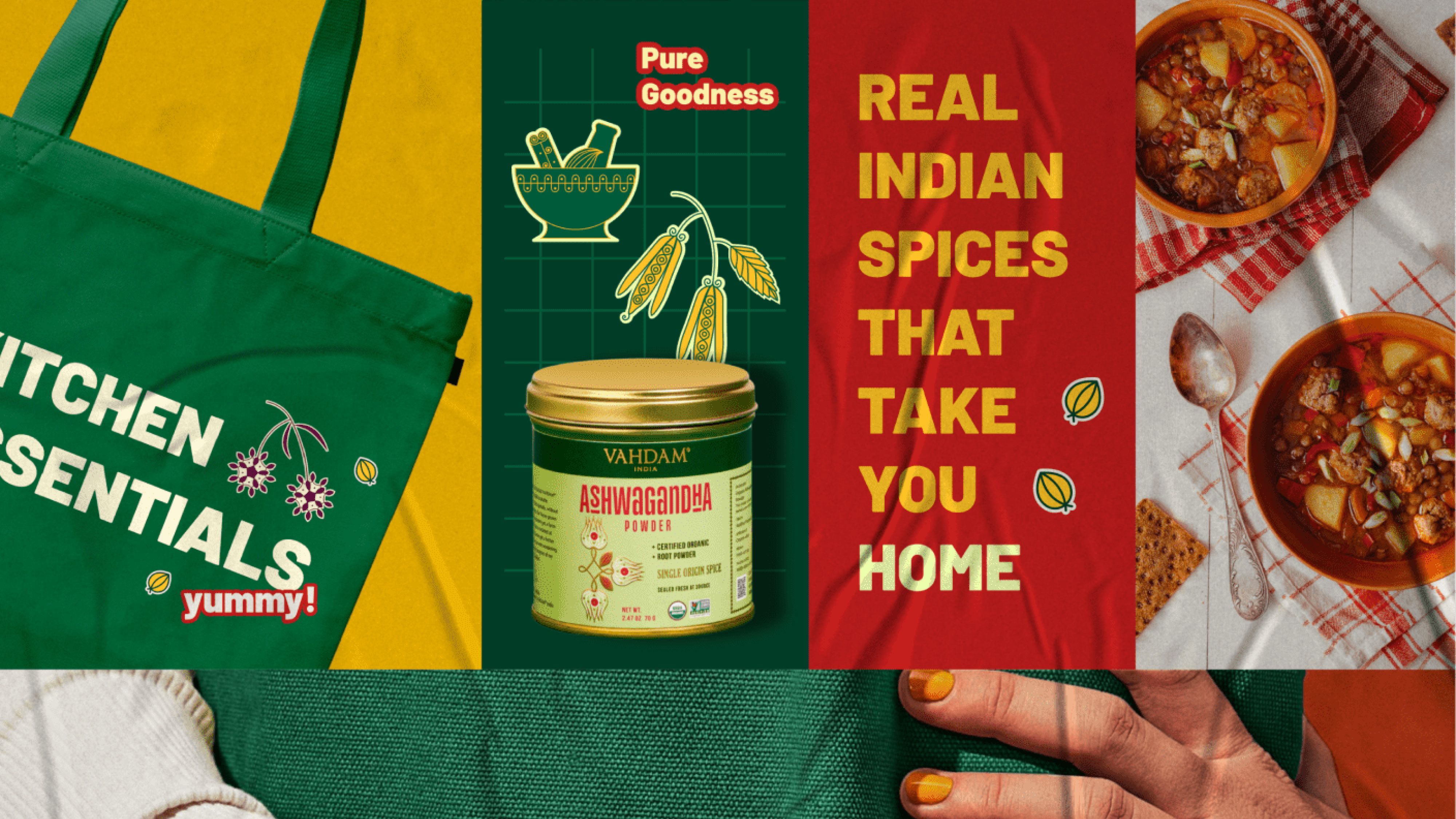
‘Vahdam Spices’
Mother tongue designed the packaging and look & feel of Vahdam’s global line of spices. I loved the tone MTD took to representIndia and the spices India is so popular for on a global level, the illustrations, colours, typography and the positioning of the brand represents the country that it originates from brilliantly. The labels follow a colour system based on the spice flavour profile creating a unique identity for Vahdam Spices.
Taste the flavour:


