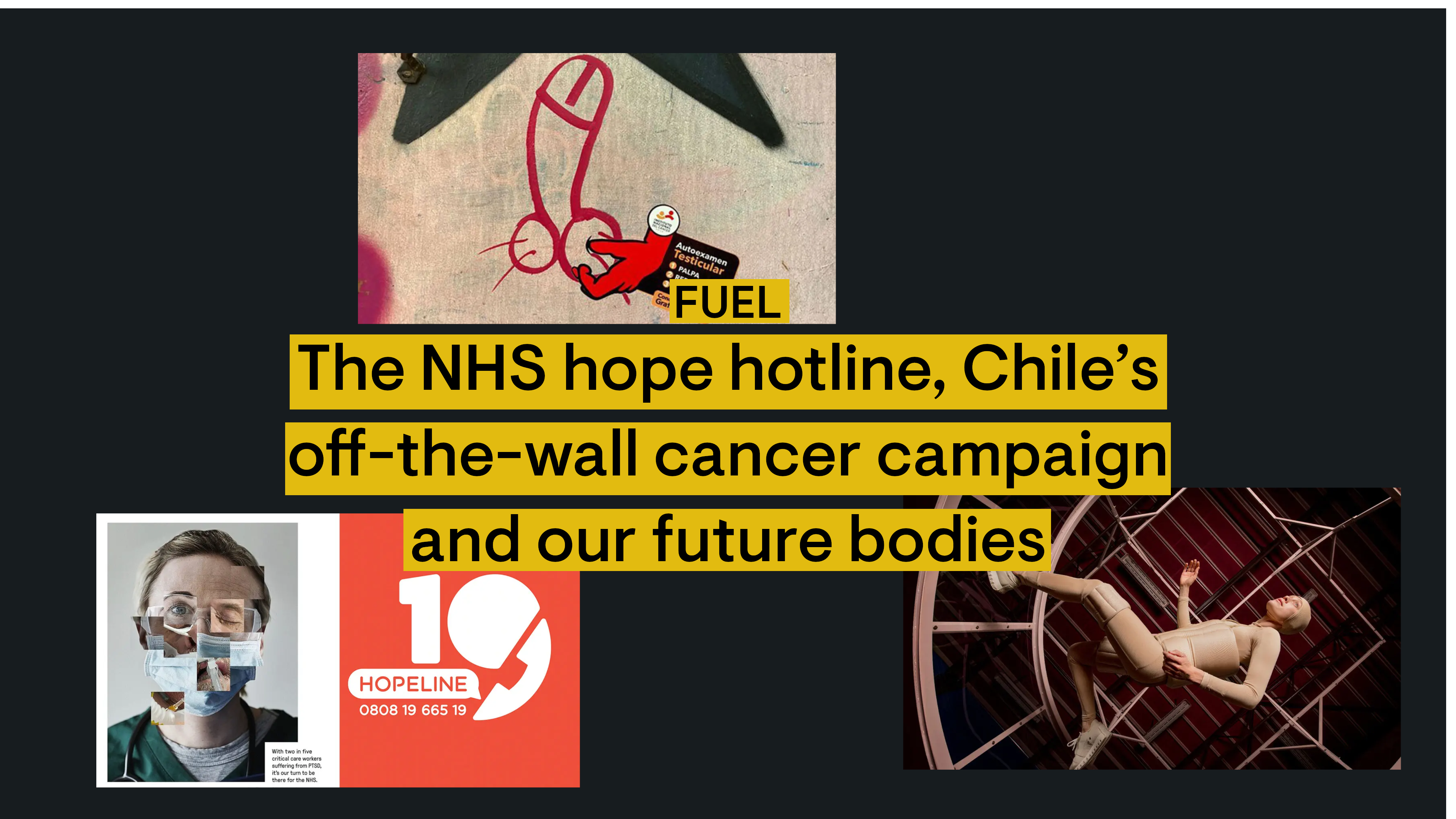
Today we’re looking at shock advertising; shockvertising. Do shock tactics result in positive action? Or do they cause serious messages to be quickly dismissed? The Thompson team has handpicked a selection of work created to grab the viewer's attention.
– Frontline workers need you
– Let’s talk balls
– Are you ready for space?
The hidden pandemic
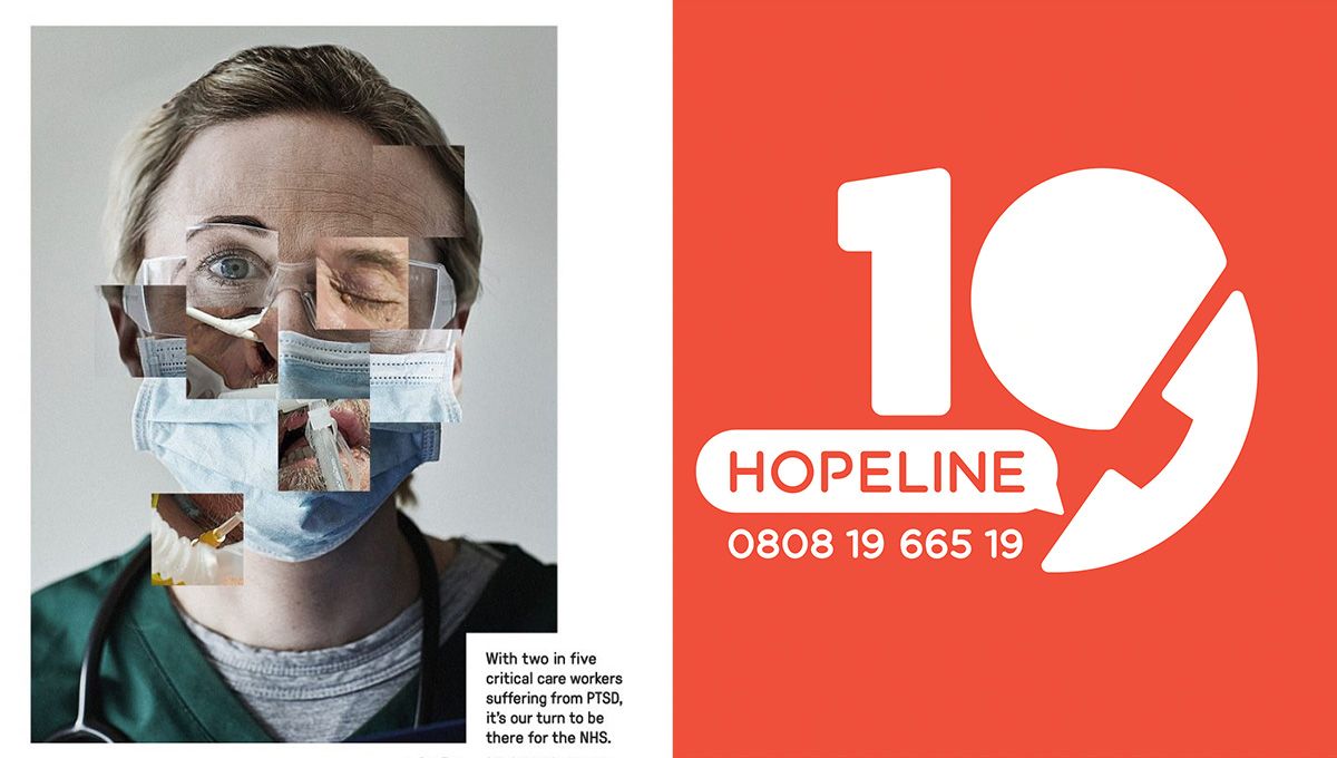
“One crisis has caused another” are the words leading Frontline19’s campaign to tackle the rise in frontline staff suffering from post-traumatic stress disorder.
Using striking imagery and a thought-provoking film the campaign highlights the growing severity of the issue and emphasises the need for wider public involvement. At first glance the image is shocking and gruesome but closer examination of the design, reveals it’s made up of the images which haunt frontline workers daily. Accompanied with the statistic that two in five frontline workers suffer from PTSD, it dawns on the reader this is truly the hidden pandemic.
The campaign prompts the public to use the free phone line, Hotline19, to leave messages of hope and encouragement for frontline workers to listen to when they’re feeling discouraged.
Ellie Polston, our Senior Designer, says:
"The campaign stopped me in my tracks when I first came across it, with its horror movie aesthetic. But for me, it seems at odds with the objective of the campaign – to gather messages of goodwill and support from the public."
Taking cancer by the balls
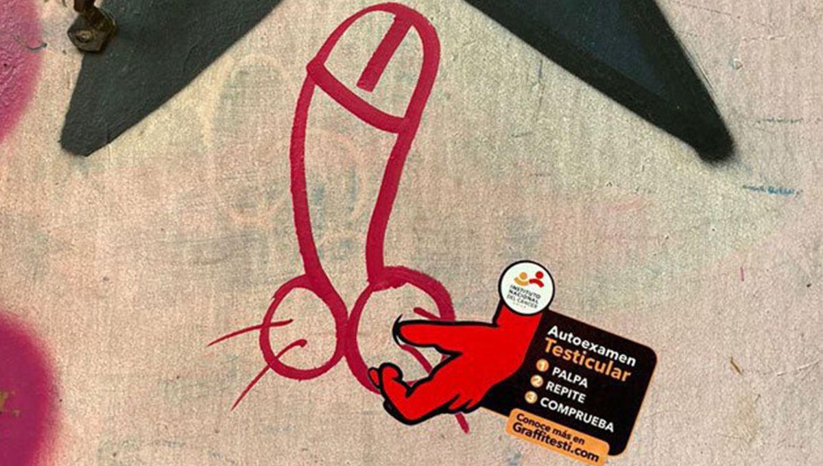
Graffiti of male genitalia is a common sight when walking through cities around the world. What’s more unusual however is hijacking it for a campaign to get men talking about cancer.
The Instituto Nacional del Cáncer has done just that with a new campaign designed by McCann Santiago. With the aim to get people talking, they’ve added stickers onto the male genitalia graffiti adorning Chile’s public spaces to create the image of balls being gently prodded by a hand, along with basic instructions on how to perform a testicular self-exam.
Cancer is a topic that’s scary and often avoided but early diagnosis can lead to higher cure rates. So, the Instituto Nacional del Cáncer hopes that by turning a taboo subject into something that gets people talking it will potentially save lives.
Paul McGuigan, our Strategy Director, says:
"This is a really nice idea, taking advantage of a cultural phenomenon we’ve probably all seen around - sometimes drawing a chuckle, sometimes a raised eyebrow and sometimes a bit of anger - depending on where it’s seen. Rarely do graffiti knobs go unnoticed though, so what better place to place an important message you need to be seen by everyone?
Fly-posters and stickers placed in street / public locations always struggle for attention, but the ones that work best interplay with their surroundings in some way, and this is a great example.
It’s cheeky, risqué and makes use of an asset most people would prefer to ignore.
Lots of us know self-examination is vital in the fight against cancer, and that people don’t do it enough, so anything that gets that message out with a bit of bold creativity is good in my book.
Having seen a REALLY annoying spray-painted knob appear in my own local park recently, I find myself wondering where I can get hold of one of these stickers to make it a little more acceptable and purposeful!"
What's in our future?
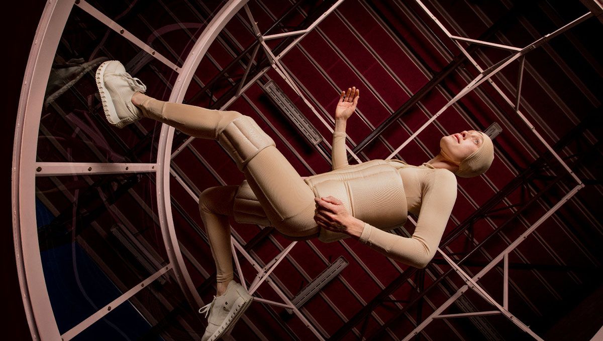
Imagine a future exposed to space travel, shaped by technology, genetic engineering and social isolation? Now imagine what your body would look like inhabiting such a future space?
Lucy McRae explores these long-term implications of training the body to better adapt to a life in space and speculates on the future of human existence within her fictional documentary: Institution of Isolation.
McRae’s work sits outside the norm and provokes her audience to think differently and step outside their comfort zones. She believes this challenge could also be extended to brands and businesses. If they went through a creative process at the start of any research, this would allow moments of chaos and serendipity – proven gateways to innovation.
Something to try in your next planning meeting?
Chris Skelton, our Creative Director, says:
“Everything about the presentation of McRae's art here feels like it was designed to create a sense of discomfort for the viewer. Right from the idea of isolation, which is an uncomfortable thought itself, through to the lo-fi, almost DIY product design that feels like it's come straight from the Handmaid's Tale, to the sense of suffocation and claustrophobia that's depicted in each scenario, through to the dystopian institutional environments and sepia colouring of the images. All intentional, I have no doubt. It's perfectly intriguing in its unusualness and despite all the negative feeling that it conjures you just can't help being left wanting to know more.”
