We’re pleased to share our recently completed rebrand of Cromwell – the leading international supplier of industrial tools and equipment.
Founded in 1968, Cromwell is famous for its safety, cutting, power and hand tools. It has been part of Grainger since 2015, a $12bn turnover Fortune 500 company based in the US.
A new MD and business strategy involved a re-focus on the strengths of the business to make the most of market opportunities. To help with this, we were commissioned to carry out a rebrand in early 2019.
In a fiercely competitive marketplace, it was important to understand not only what lies at the heart of Cromwell, but also what sets it apart. Several rounds of customer insight work by Boxclever and extensive colleague engagement, laid the foundations. It was crucial to create a compelling brand purpose and after consultation and development this was defined: ‘We keep operations running and people safe.’
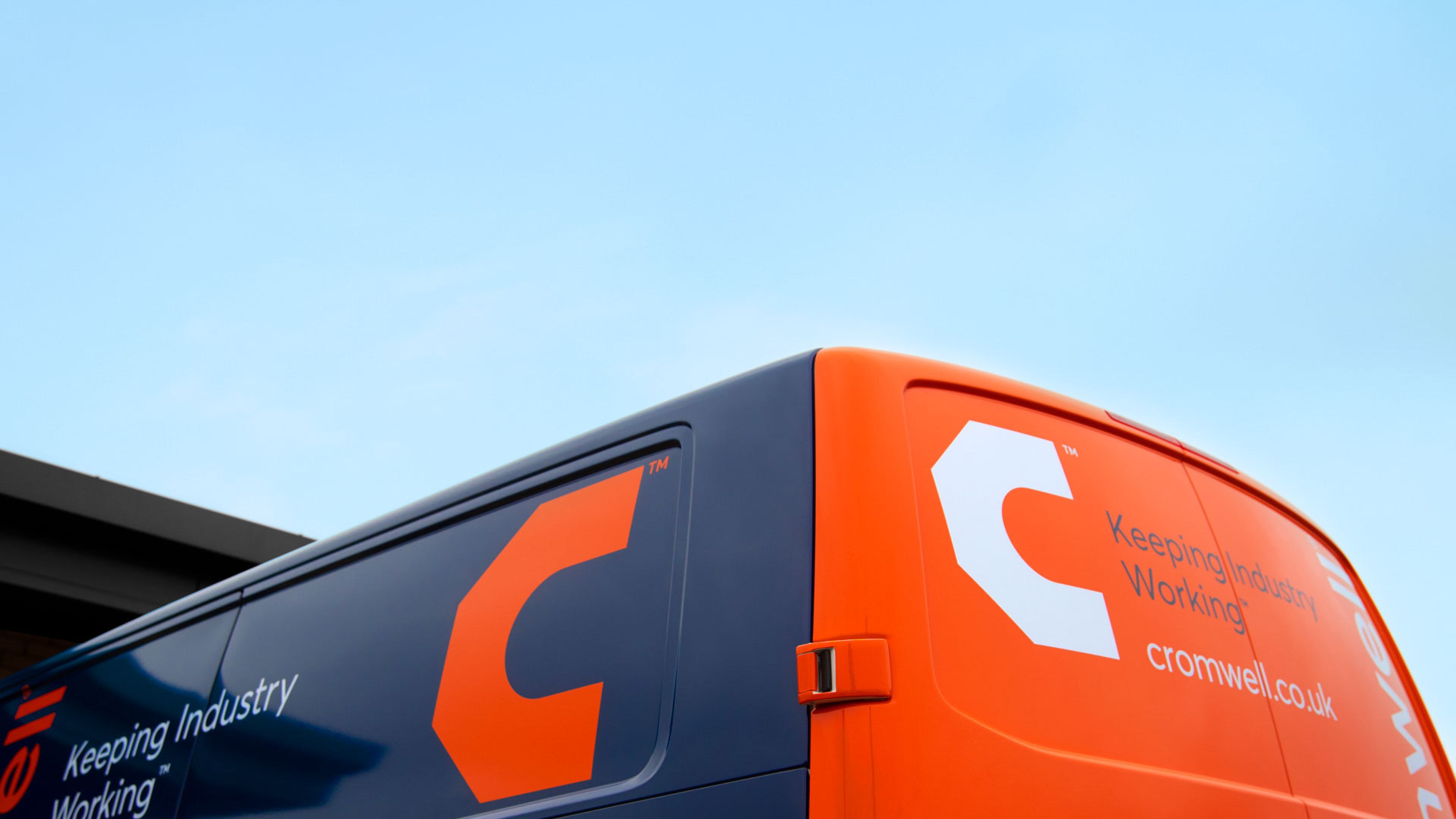
The existing branding had been relatively untouched for many years and featured the helmet of Oliver Cromwell, so a new logo was developed to signify change and to portray Cromwell as a well-organised, contemporary business specialising in tools and safety. The introduction of orange helps make the brand feel more friendly and the removal of the helmet icon signified a whole new chapter for the brand. To complement the symbol, the wordmark was re-drawn to reflect the same values. It felt like a new version of Cromwell, keeping the best bits and modernising the rest.
Boxclever returned to the same customers to test the new identity and got a hugely positive response. Verbatim customer quotes included:
“The new logo says engineering, manufacturing and tools.”
“It is contemporary, but straightforward.”
“Angular = precise, efficient, sharp and on-time.”
“Orange and blue combination = bright, smart, contemporary, professional, friendly, reliable.”
The new branding recently launched and we have applied throughout the business to the website, colleague uniforms, vehicles, signage and throughout the internal communications in the business. A new branch has also recently opened in Evesham, connecting Cromwell with many customers in the area.
Cromwell MD, Neil Jowsey, is delighted with the new brand: “From my first day here it was clear that Cromwell is a fantastic business with great people and an amazing set of customers. We are doing great work to help our customers keep their operations running and people safe, yet our brand identity was tired, old-fashioned and did not portray us in the best light. I have worked with the team at Thompson before and knew their thinking and creative work would be excellent – creative, clear and commercially orientated. And it has been exactly that, as proven by some of the most positive customer feedback I have ever seen.”
Our own MD Nick Ramshaw led the project: “We love working with Cromwell. They are leaders in their field with huge ambition and a very clear purpose. The new brand reflects this and provides the whole team with a new contemporary flag they can all be proud to stand behind.”